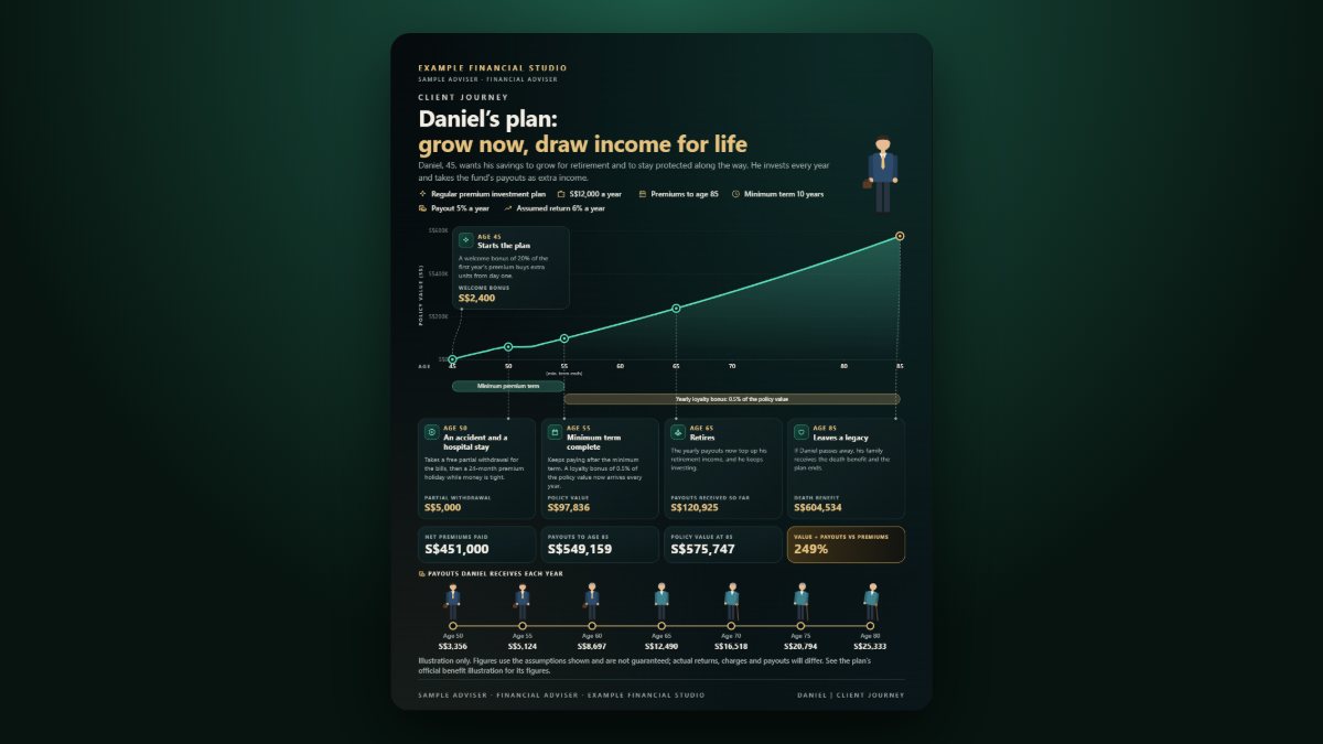
A benefit illustration for a savings or retirement plan can run to dozens of rows of numbers: premiums paid, guaranteed and non-guaranteed values, bonuses, surrender values, age by age. It is accurate and almost unreadable. Clients nod, sign and forget. A timeline tells the same story in a way people remember: what you put in, what grows, the milestones along the way, and what comes out, and when.
This guide shows how to turn a plan into one honest, readable chart, and introduces a free Plan Journey chart maker that does the drawing for you.
Key takeaways
- Show the plan by age, not by policy year. People think in "when I am 55", not "year 23".
- Mark three to five milestones that matter to the client: a child's university, retirement, a payout start.
- Separate what you pay in from what comes out, so neither is hidden.
- Label non-guaranteed values clearly. A beautiful chart must not overstate a projection.
- Keep the full illustration: the chart is a summary of it, not a replacement.
Why a timeline works
Numbers in a table are compared one at a time. A line over time shows the shape: the years of paying in, the point where value overtakes what was paid, the payout years. Clients can point at the chart and ask "so at 60 I start getting this?", which is exactly the conversation you want.
What to put on the chart
- Value by age: the projected policy or plan value, one point per year or every few years.
- Total paid in: premiums or contributions to date, so the client can see when value exceeds cost.
- Milestones: a few labelled points, such as "Emma starts university (age 52)" or "Retirement (65)".
- Bonuses or one-off amounts, if the plan has them, shown where they occur.
- Withdrawals and yearly payouts: when money comes out, how much each year, and the running total.
- A short totals box: total paid, total received, value remaining at the last age shown.
How to stay honest
A chart is persuasive, which is exactly why it needs care:
- Say which figures are guaranteed. If the projection uses an illustrated rate, write it on the chart, for example "Projected at 4.25% p.a.; not guaranteed".
- Do not pick the best-looking scenario only. If the illustration shows two rates, mention the lower one too.
- Show withdrawals reducing the value. A line that keeps rising while money is taken out is not believable.
- Keep the source. Note the illustration date and reference so anyone can check the numbers.
Step by step
- Take the ages and projected values from the benefit illustration (every year, or every five years for long plans).
- Add the premium or contribution years and the total paid.
- Choose three to five milestones and label them in the client's words.
- Add withdrawals or payouts at the ages they start and stop.
- Add the note on guaranteed and non-guaranteed values.
- Export the chart and walk the client through it from left to right.
The Plan Journey generator takes values by age, milestones, bonuses, withdrawals and yearly payouts and draws them as one illustrated chart with totals, in your choice of theme and size.
Try it free: Load the sample plan, replace the values with the client's illustration and export a chart you can walk through together. Open the Plan Journey chart maker on CREATEFOR.YOU. It runs in your browser, needs no sign-up to build and preview, and the entries you type are not sent to the server.
Frequently asked questions
Should the chart show every year?
For plans up to about 30 years, every year works. For longer plans, every two or five years keeps the chart readable, with milestones added at their exact ages.
Can a timeline replace the benefit illustration?
No. The illustration is the formal document. The timeline helps the client understand it and should always be consistent with it.
What if the plan has both guaranteed and non-guaranteed values?
Chart the projected value and write the guaranteed position in a note or as a second line. Never present non-guaranteed values as certain.
Related reading
- Planning retirement income around CPF LIFE
- How to fund several financial goals at once
- Visual recap templates for financial advisers
General information only. Projections are not guarantees; refer to the insurer's benefit illustration and product summary. A timeline chart is not a benefit illustration: licensed representatives should use it only as their firm's compliance policy allows.